5 Best Urban Vibe Mockups for 2026


- All Posts
- Creative Blog
December 30, 2025/
No Comments
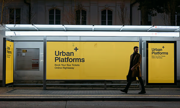
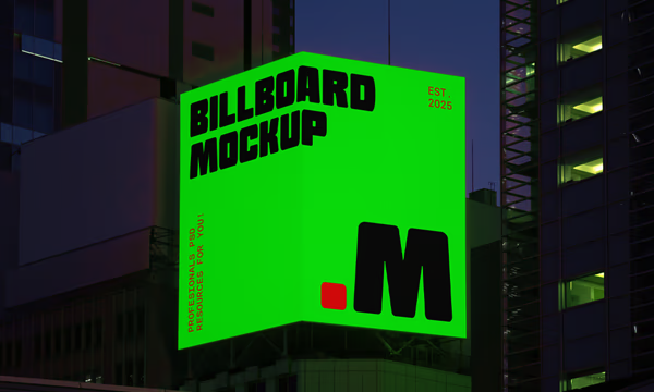
5 Best Urban Vibe Free Mockups 2026 It’s always nice to present your logo or artwork on a mockup. We...
October 22, 2025/
Why Ford’s Classic Logo Needed a Fresh Look How this New Design Brings It to the Future The Ford logo...

October 11, 2025/
Five Fonts To Make Your Rock Band Logo Badass 2025 It’s quite important to select the correct font for your...
5 Best Urban Vibe Mockups for 2026 Read More »


